| Author |
 Topic Topic  |
|
|
Stock2935
Active Member

USA
44 Posts |
 Posted - 09/02/2002 : 09:58:21 AM Posted - 09/02/2002 : 09:58:21 AM


|
Hey,
Does anyone know the specific size of font school districts or contractors use on the side front and rears of buses. Does anyone also know the specific type of font that has to be used and i know the sizes differents but what are the parameters. Ive also noticed different manufacturers use different style fonts. Any help would be apprecitated.
Thanks
GM |
|
|
thomasvista2012
Top Member

USA
747 Posts |
Posted - 09/02/2002 : 10:40:02 AM
|
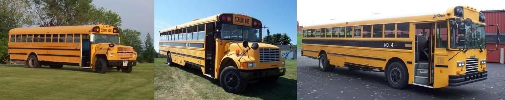
Florida specifies the letters and the numbers on the side of our school buses to be a minimum of 4' in height. The font used has varied by district and manufacturer in the past. Some manufacturers such as Thomas have used up to 3 different fonts on their buses.
Some states such as Virginia use a uniform font and size on all their school buses.
School Bus Terminal
http://www.schoolbusterminal.net |
 |
|
|
wagonmaster
Top Member
USA
2298 Posts |
Posted - 09/03/2002 : 05:17:32 AM
|
Florida specifications (2002, revised, page 13 group III) require the "School Bus" letters front and rear to be 8", series B, standard alphabet, and the school district identification on each side to be 6" same font. The font cannot vary from district to district, but must remain consistant throughout the buses produced on any particular bid, per bid requirement.
Joe
|
|
|
|
Skewl Bus Boi
Advanced Member

USA
323 Posts |
Posted - 09/03/2002 : 08:46:23 AM
|
It varies...you can pretty much specify any lettering you want, within state specs. And it's not always the manufacturer who puts the lettering on, sometimes dealers do, sometimes the school/contractor does it themselves.
As for the requirements, it varies by state. FL and VA specs are posted above. CT and MA are like the old FL specs, in that there are size requirements, but you can use any font you want.
�Phil
"Blue Bird!" "of happiness?"
Edited by - Skewl Bus Boi on 09/03/2002 12:19:23 PM |
|
|
|
thomasvista2012
Top Member
USA
747 Posts |
Posted - 09/03/2002 : 10:09:52 AM
|
Thanks for the correction Joe, I was looking at older specs. I naturally assumed the lettering didn't change.
School Bus Terminal
http://www.schoolbusterminal.net |
|
|
|
Steven A.Rosenow
Top Member
USA
1926 Posts |
Posted - 09/04/2002 : 4:55:24 PM


|
Blue Bird has basically been using Highway Gothic or "Blue Highway D Type" for the last 20 years. All of our Blue Birds use Highway Gothic as the style of lettering.
Gillig used a font called "Arial Standard Extra Black" on the sides of their buses, and on the words "School Bus" between the flashers, it varied from "Arial Standard Condensed Bold" to "Century Gothic Bold Condensed".
It's different for the other manufacturers, but being a sort of font creator myself, I've become familiarized with those fonts above.
Now, as for the logo fonts on buses, Gillig used a custom font that was just recently reprised in a font called "Guanine." Crown used a font similar to a freeware font called "Clearwerkkraftremix" and Blue Bird used a number of fonts, including Slicker, Collegiate Bold, and blue Highway D type.
On Thomas, they tended to use a font similar to "News Gothic" but the letters were slightly modified.
Signature Pending. Hehe.. Have to come up w/ a new one while I find another image host site. |
|
|
|
Jared
Top Member
USA
1865 Posts |
Posted - 09/04/2002 : 8:18:49 PM
|
When I was in california recently,
I spotted a BlueBird RE with a pre-1996 Thomas logo,,,odd looking
|
|
|
|
Buskid
Top Member
USA
3368 Posts |
Posted - 09/04/2002 : 9:21:56 PM
|
quote:
When I was in california recently,
I spotted a BlueBird RE with a pre-1996 Thomas logo,,,odd looking
Kind of like the Blue Bird GMC Conventional and the Crown Supercoach that I saw with the Thomas logo on the roof.
Crown Supercoach - The �Royalty� of Pupil Transportation |
|
|
|
thomas86_a
Top Member
USA
4413 Posts |
Posted - 09/05/2002 : 05:09:08 AM
|
It's funny how everyone wants Thomas logo's on their buses. 
"America's #1 Conventional School Bus- Thomas/International."
|
|
|
|
Skewl Bus Boi
Advanced Member
USA
323 Posts |
Posted - 09/05/2002 : 08:32:32 AM
|
quote:
It's funny how everyone wants Thomas logo's on their buses.
Actually, it's just due to the incompetence of First Student.
�Phil
"Blue Bird!" "of happiness?" |
|
|
|
BusBoy
Top Member
USA
2042 Posts |
Posted - 09/05/2002 : 11:52:58 AM
|
Phil,
Why do you say First Student? I know most of the Blue Birds that First Student buys do not have the logo on them.
|
|
|
|
Buskid
Top Member
USA
3368 Posts |
Posted - 09/05/2002 : 12:49:52 PM
|
quote:
Why do you say First Student? I know most of the Blue Birds that First Student buys do not have the logo on them.
I don't mean to answer for Phil, but most of the buses that I have seen in Calif. with the mismatched logos on the roof have belonged to either First Student or Four Winds. I think that's why he said that.
Crown Supercoach - The �Royalty� of Pupil Transportation |
|
|
|
Skewl Bus Boi
Advanced Member
USA
323 Posts |
Posted - 09/05/2002 : 5:42:24 PM
|
Exactly, the pic I've seen of a Crown with the Thomas logo (btw, that logo may have only been standard up to 96, but it's still available) was a First Student bus in CA.
�Phil
"Blue Bird!" "of happiness?" |
|
|
|
SteveCof00
Senior Member

USA
128 Posts |
Posted - 09/08/2002 : 01:29:11 AM
|
Going back to the fonts....
Our Blue Bird TC's (now retired?????) used the standard factory font...an arial-type that was "shortened" to fit in between the rub rails.
Our old Wards used the same kind of "arial" that we used on AmTrans up until 1998. After that, we switched to a much bolder font (easier to read the numbers). What was interesting about some of the Wards is that while the lettering was just ordinary vinyl stickers, some buses had numbers that were hand-painted. We still have one AmTran Volunteer with hand-painted numbers (#344 is the only one that didnt get sticker numbers).
Does anyone know if International/ICC offers a "condensed" font? Our 2002 RE's have lettering/numbering that is bold and condensed...almost like Apple's "Techno" font.
|
|
|
|
wagonmaster
Top Member
USA
2298 Posts |
Posted - 09/09/2002 : 05:09:20 AM
|
The vinyl lettering is done, at least the district/school name, etc., by computer on a bus by bus basis at each body plant that I am aware of. They can probably modify their font slightly, but usually don't or won't. Too many variables already to keep things straight as it is without adding another. The "fixed" requirements such as the 8" "school bus" on each end cap, are pre-made for all buses from manufacturers for quality and (mostly) price reasons. With few exceptions, pretty much what you see is what you get from the body builders, and that's as it should be. Let them concentrate on the important stuff at the plant level. As was already pointed out, many dealers and/or districts buy/make/install their own lettering and can design logos and slightly different fonts, etc. Hope this helps.
Joe
|
|
|
|
kentuckynascar1
Advanced Member
USA
489 Posts |
Posted - 01/01/2004 : 5:09:51 PM
|
| The Kentucky Regulations for school bus lettering. The school district and bus number must be 6 inches high and use 1 inch stroke and must use Reflexite of 3M film. Also, this info must be on a black band 8 inches high and running the length of the bus body. The rear number is mounted on the right license plate area and the number is also on both sides of the body cowl under the windshield. They must be 6 inches high and use 1 inch stroke using vinyl decals, with the exception of buses with four digit numbers, then the numbers are 4 inches high and use 3/4 inch stroke |
|
|
|
BlueBirdMan
Senior Member
193 Posts |
Posted - 01/01/2004 : 6:59:11 PM
|
| Does anyone know the font that is used on the side (school district name) of crown buses? |
Bring back the "backing" sign! |
|
|
|
Chris
Top Member
USA
1013 Posts |
Posted - 01/01/2004 : 7:13:23 PM

|
| I love our Kentucky buses with the white letters on black background. I think it makes them look nice. |
My Personal Fleet
1985 Ward Ford #1 Lexington Local - 1990 Wayne International NO.2 Walton-Verona - 1992 Ward Senator NO.4 Walton-Verona *SOLD* |
|
|
|
SchoolBusFan
Top Member
USA
1769 Posts |
Posted - 01/03/2004 : 11:42:20 PM
|
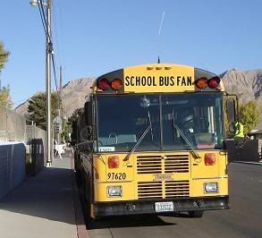
| On some of the Thomas "EMERGENCY EXIT" signs (what I see in Clark County, NV), the font is Impact in Italics, maybe even bold. I even printed some signs over my doors in my room, lol!! EMERGENCY DOOR over my door, and EMERGENCY EXIT over my window. Makes it easy to know where to escape, lol. |
Check out my new Yahoo group:
http://autos.groups.yahoo.com/group/ccsdschoolbuszone/
|
|
|
| |
Topic |
|